

Role
Visual Designer
UX Researcher
Process
Task Flow
Redesign
Prototyping
Heuristic Evaluations
UI Libraries
Duration
3 weeks
Tools
Figma
InVision
Partner
Objective
The purpose of this project was to openly collaborate and become more familiar with Jakob Nielson's 10 Usability Heuristics. By utilizing the heuristics, we conducted heuristic evaluation on one of the internet's top classifieds sites - Craigslist. Using the insights gained from our analysis, it provided us with inspiration to craft a human-centered redesign based on one of Craiglist's listing flows.
↓
I've Never Used Craiglist Before...Just What Is It?
Craigslist is one of the internet's first of many online classifieds advertisement websites, with roots dating back to 1995. As of the most popular classifieds listing pages out today, it has managed to expand to many major cities all around the world. However, it was only recently, as of Janurary 2020, that Craigslist released their mobile application onto both the iOS App Store and Google Play Stores.
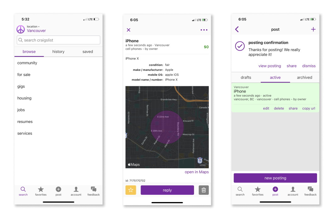
The current layout of Craiglist's Mobile App on iOS
The Problem
Craigslist’s version 1.0.0 app was released in January 2020 and has not been given an update since. As one of the leading classifieds listing page and with society shifting to mobile devices, it was the right move for Craigslist to make the transition towards a more mobile friendly platform. But as big and popular Craigslist is, the ratings and reviews on their app seems to indicate otherwise.
That made us think: why were the ratings so low, and how can we fix it?
Let's Talk Constraints.
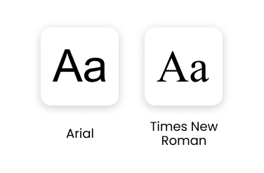
We decided that some elements of the brand would not be changed, such as the colour palette and the font choices (although, we stuck with only Arial in order to give the redesign a more modern feel). This is because we wanted to stay true to the nature of the brand; and in order to align with the company’s image, we had to work around these constraints.
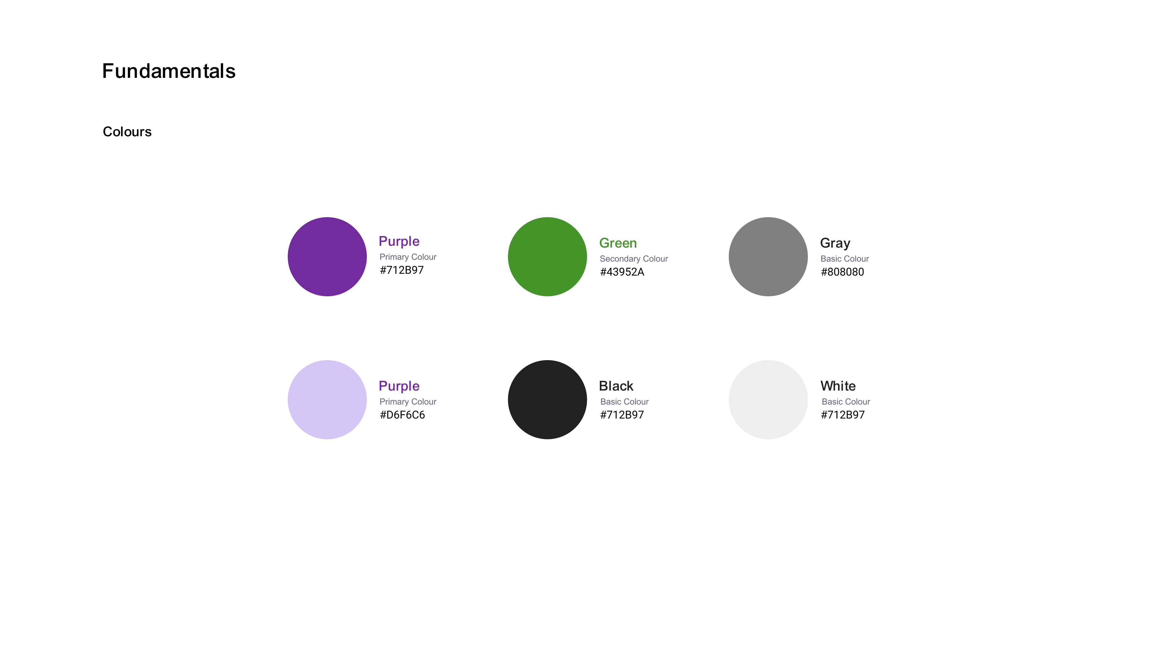
CONSTRAINT #1: COLOUR PALETTE
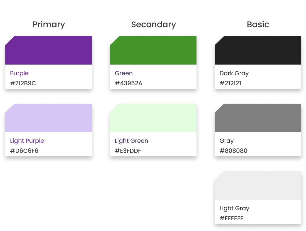
CONSTRAINT #2: CHOICE OF FONT
Heuristic Evaluation
IDENTIFYING USABILITY ISSUES WITHIN THE CRAIGSTLIST APP
In order to diagnose these issues, we had to conduct a heuristic evaluation on the product. There were some questions that resonated through our minds:
"Why does the app receive such low ratings?"
"What is causing the lack of change?"
"What exactly is making people feel frustrated when using the app?"
"How do we begin to fix it?"
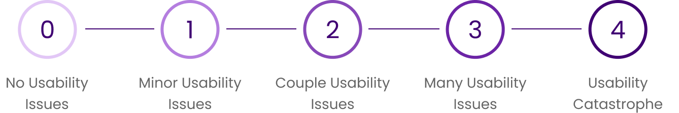
It was through our research that we came to the conclusion that Craigslist has two fundamental task flows. Our chosen primary task flow, creating a new posting, had a myriad of usability issues. We rated each instance on a scale from 0-4 in order to determine the severity.
↓
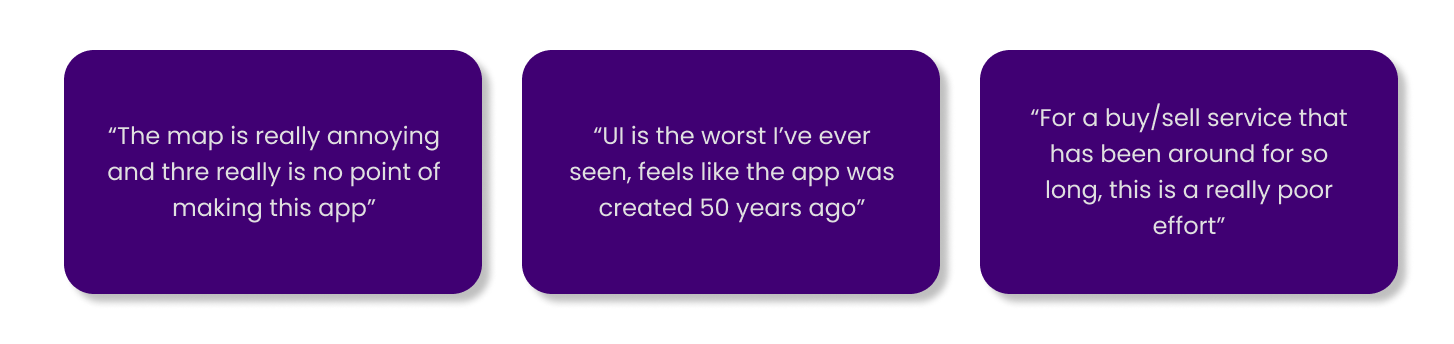
The Offenders
THE TOP SIX ISSUES THAT CAUGHT OUR EYES
LOGIN PROCESS
VIOLATES: Flexibility and Efficiency of Use
OUR SEVERITY RATING: 3
The login flow consisted of four screens - which are too many. The amount of thought required to navigate was too much. It was both inefficient and inconvenient to require users to sign in and confirm their email every time they made a new posting!
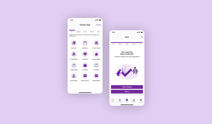
PICKING A TYPE OF POSTING
VIOLATES: Recognition Rather Than Recall
OUR SEVERITY RATING: 2
Choosing a type of posting (job offered, job wanted, for sale by owner, etc) was hard to navigate - they not organized in alphabetical order, requiring users to read through the entire list in order to find what they were looking for.
CHOOSING A CATEGORY
VIOLATES: Recognition Rather Than Recall
OUR SEVERITY RATING: 3
Similar to the "Type of Posting" screens, it was hard to navigate as everything was fairly congested into the page. Without subheaders or sections for users to navigate, users had to think long and hard before they are able to choose a category for their listing.
POSTING DETAILS
VIOLATES: Flexibility and Efficiency of Use
OUR SEVERITY RATING: 4
There were an overwhelming amount of fields and boxes for the user to fill out - the information hierarchy was just all over the place. It wasn't obvious nor easy to tell which sections were important. It was easy to get lost and succumb into errors when on this step.
PREVIEWING YOUR LISTING
VIOLATES: Consistency and Standards
OUR SEVERITY RATING: 3
Visually, the elements of the "Preview" page were fairly hard to distinguish. There were buttons screaming to grab my attention from all corners of the page. Simply put, it was busy - and the inconsistent font sizes and alignments of text contributed to this chaos.
LISTING PUBLICATION
VIOLATES: Visibility of System Status
OUR SEVERITY RATING: 2
It was easy to miss that the listing was posted successfully - without this feedback, users might get lost, not knowing if what they did was right, or wrong. What immediately catches your eye is the big, green, fluorescent box that screams at you to "edit" the listing - disrupting the overall flow of a user's attention.
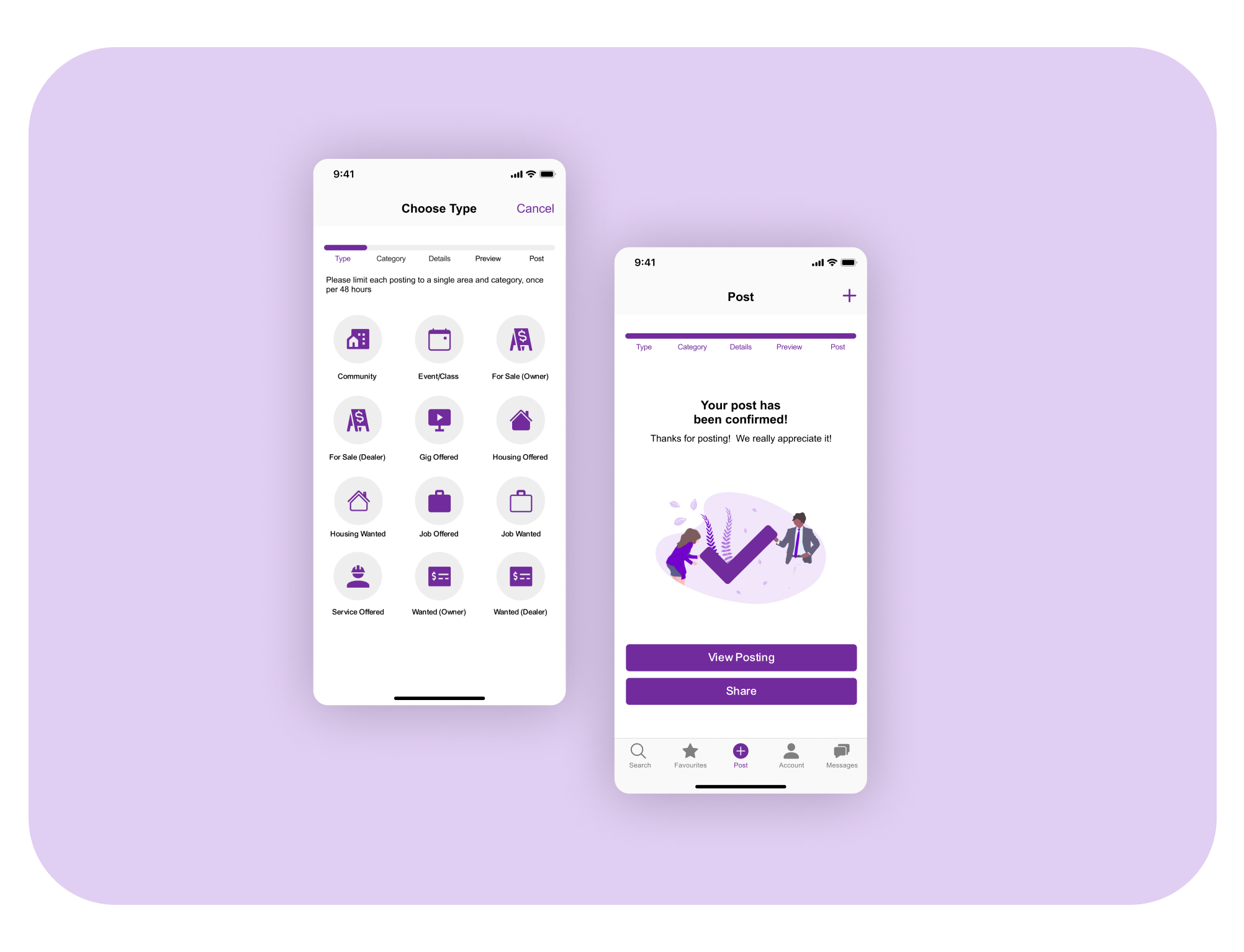
Craigslist. Reimagined.
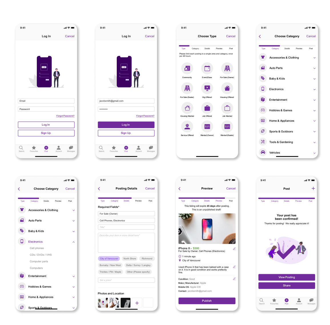
A collection of screens redesigned for Craigslist's listing flow.
See the Demo.
Final Thoughts 💭
There is no question that Craigslist has been a widely successful web-service within the past two decades. But, as the world continues to advance, mobile interfaces are taking priority over web-based ones; and this is why we believe that the redesign of the Craigslist app will drive Craigslist's success forward.
Learning about heuristics is one thing, but being able to properly apply them onto actual interfaces is another. By doing a deep dive into this project, I was able to better understand how interfaces function, and how they should be designed. No one said designing interfaces was easy - there are lots of different considerations that need to be taken in to craft something that is both beautiful and usable.
If you made it this far into this case study, I would like to offer my thanks to you! I would like to further extend my gratitutde to my project partner, James Ahn, for undertaking this project alongside me. We had a grand time working on this, and I can't wait the next project from his creative mind. You can view his work at JamesAhn.co.
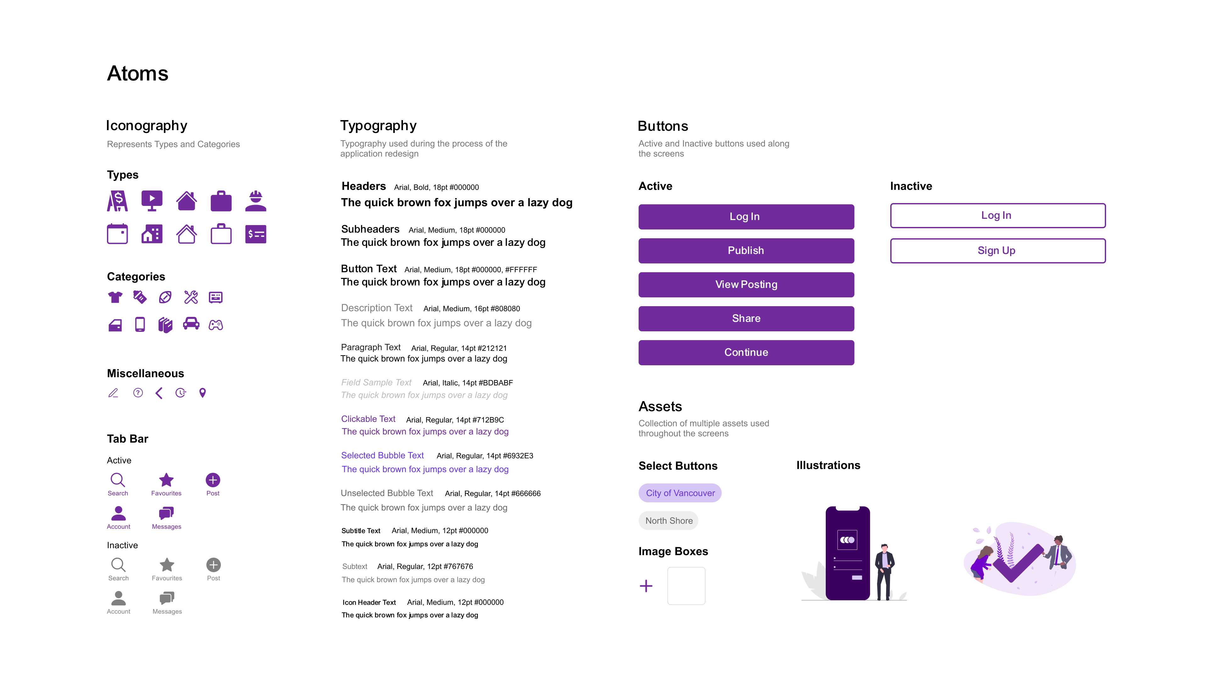
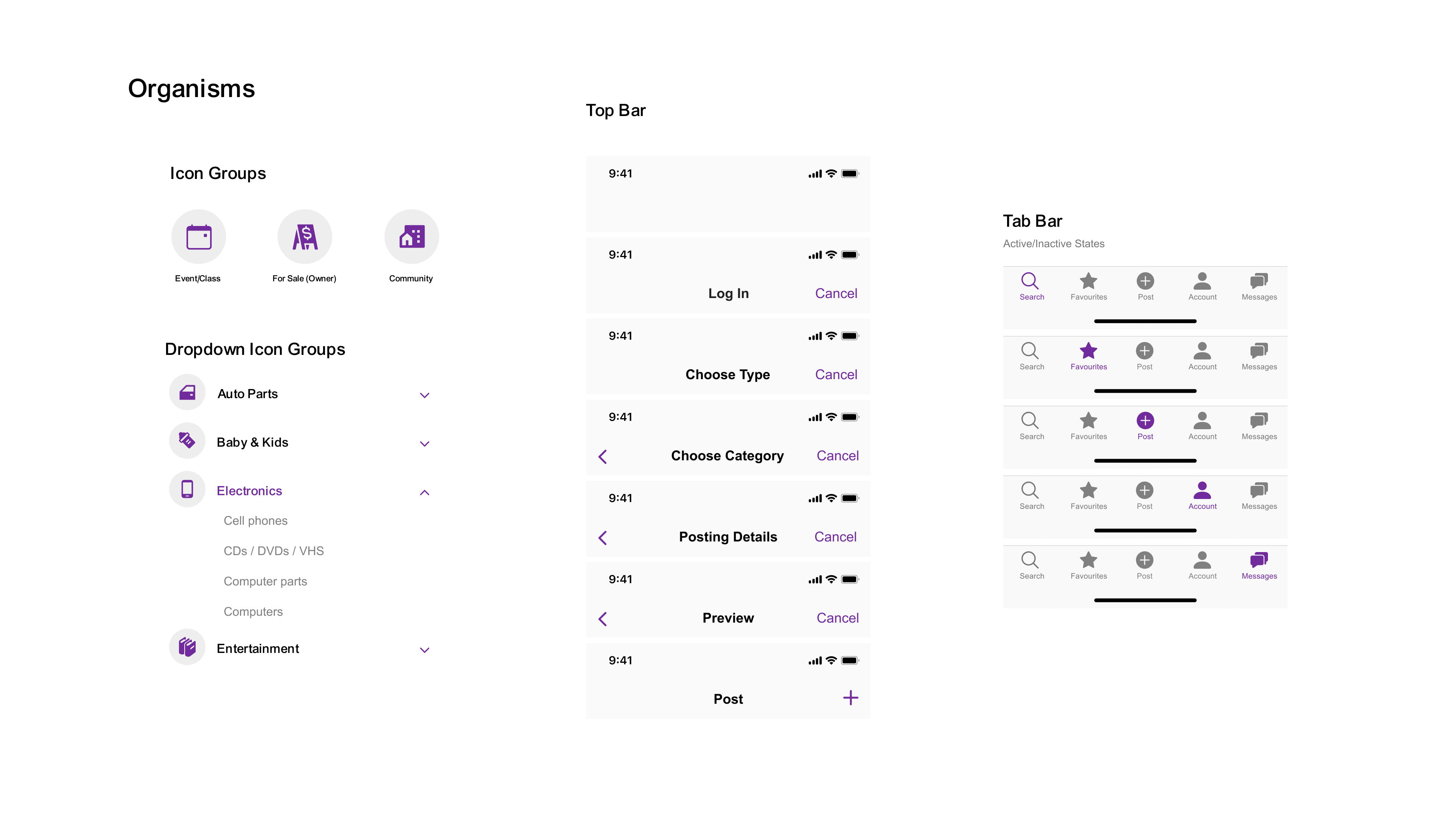
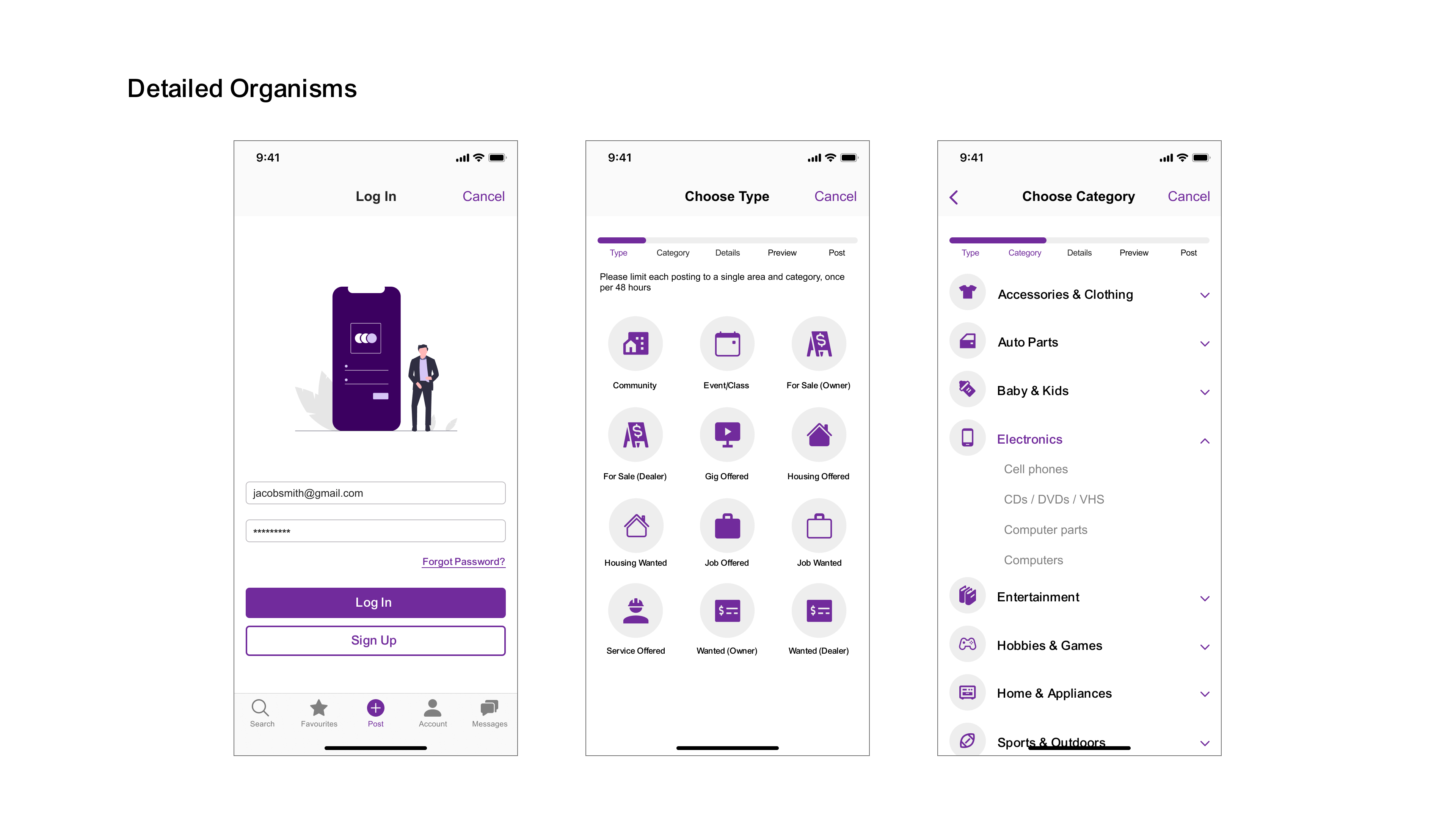
UI Library

Selected Works

TruliooProduct Experience

BeneathVancouverContent Creation
Craigslist RedesignEvaluation and Redesign
Coastal ConnectDesign Sprint
CuppaCase Study